It’s getting towards the end of July. I decided last weekend to participate in July sketch challenge on Scrap Our Stash’s blog.
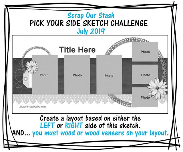
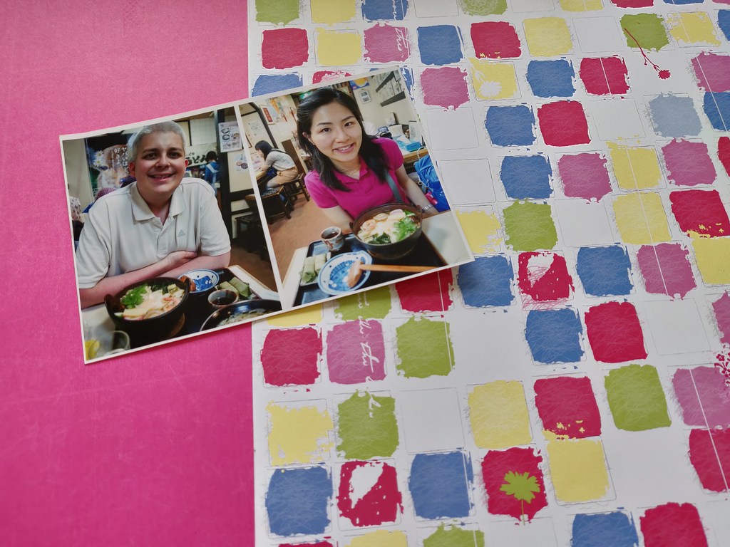
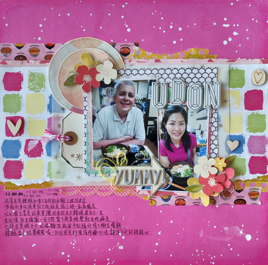
The guideline of this sketch is to use either the left or right side of the sketch. On top of that, participants must use wood veneers on their layouts. Even though I don’t have many wood veneers and they are like treasures for me, this challenge encouraged me to use them as much as I can. To make a layout for this challenge, I firstly took out all the supplies that I wanted to use to save some time later on when I started to work on my page. I chose two photos of me and my husband during our trip to Nara, Japan in 2014. I want to keep our wonderful memories during this trip.
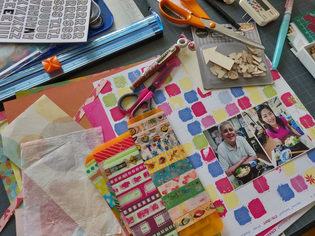
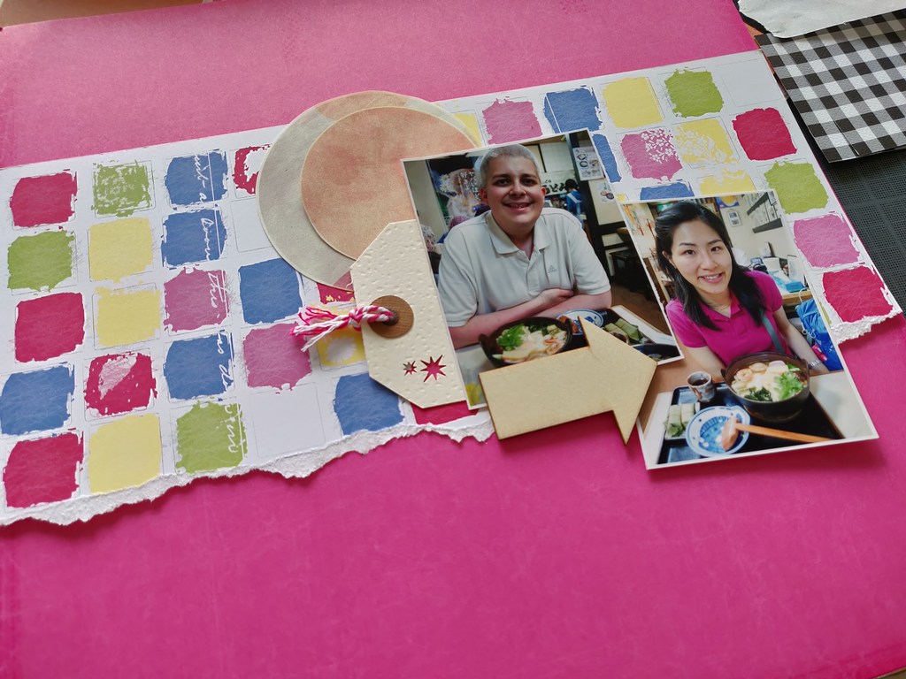
The color scheme of my page is inspired by my violet pink shirt on the photo. You can’t miss it really. I chose two sheets of paper from Déjç Views’ Cherry collection. I recently decided to scrapbook based on collections. It helps me to save time on finding matched papers. Inside each square of the patterned paper chosen, you can find red, pink, yellow, blue and green. It became my guideline to embellish my page. I know it is very colorful and bright.
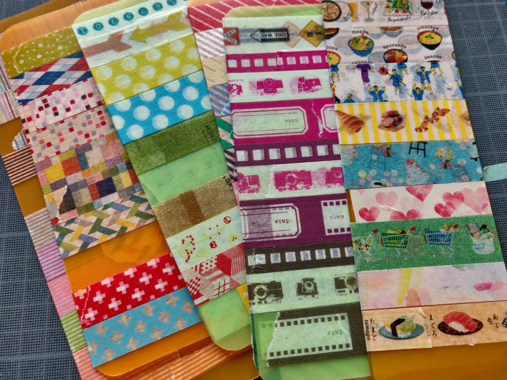
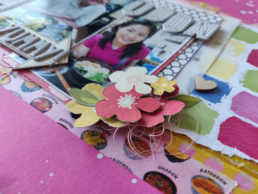
I also chose some Japanese masking tapes to create some layers. Most importantly I used some masking tapes of Japanese food design from Masté. They are so pretty that I haven’t used them until now. It’s perfect for the topic of this page.
Once I got all the supplies in one place, I started to place my photos and embellishments quickly to get some ideas. There is no use to spend to much time on this stage as I’m sure that the modifications might be needed when I start to glue everything down.
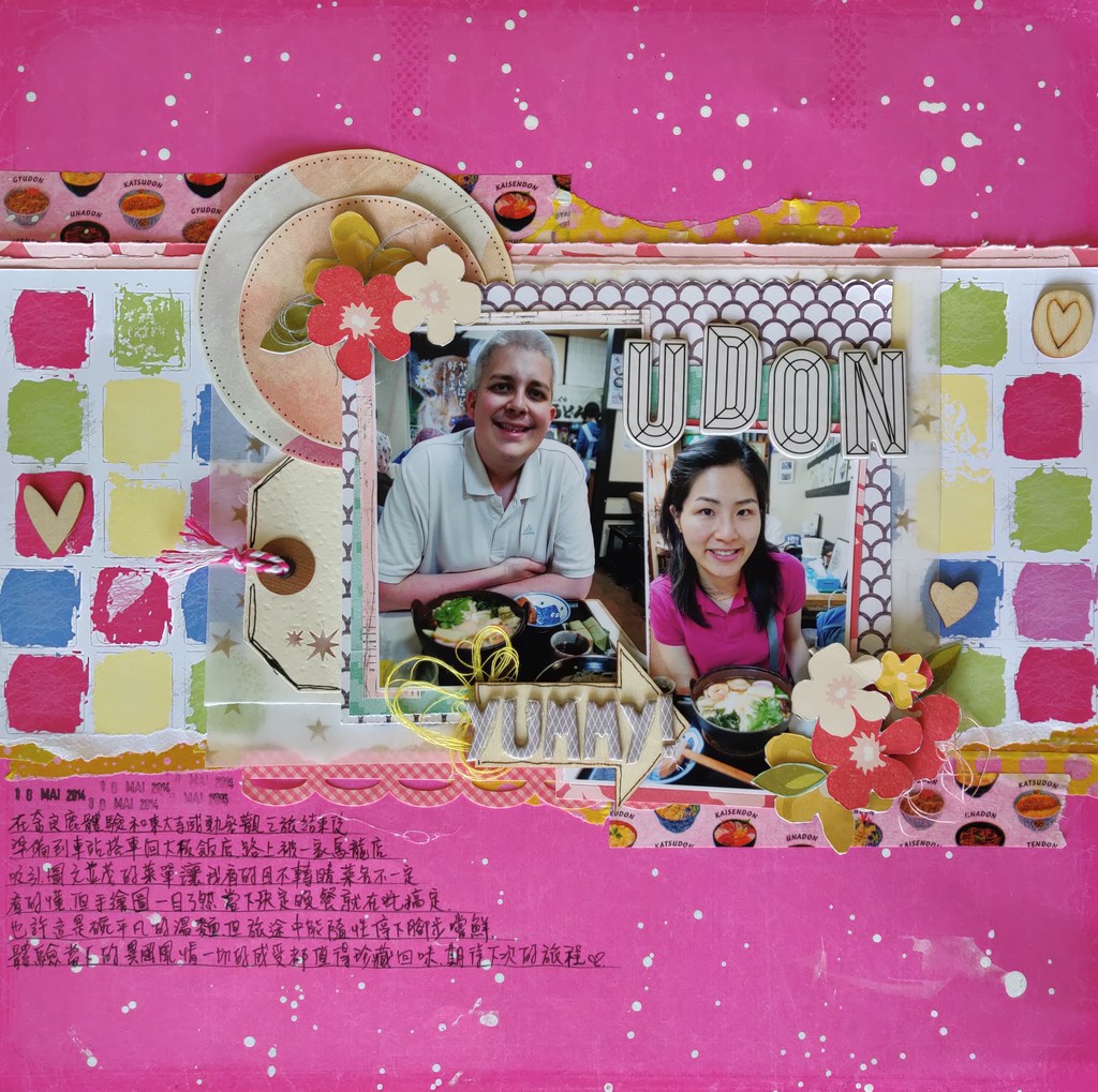
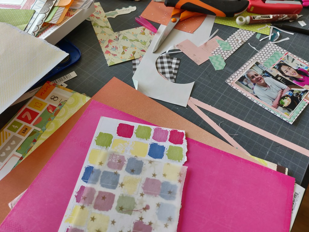
I used some sheets from Jen Hadfield’s Cottage Living collection from Pebble to back up my photos. In order to tone down the colors of the page, I added a sheet of transparent sheet on top of the background paper.
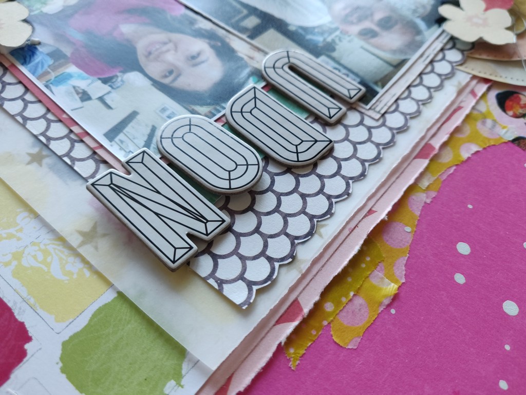
For the titles, I went for my stash of Thickers from American Crafts.
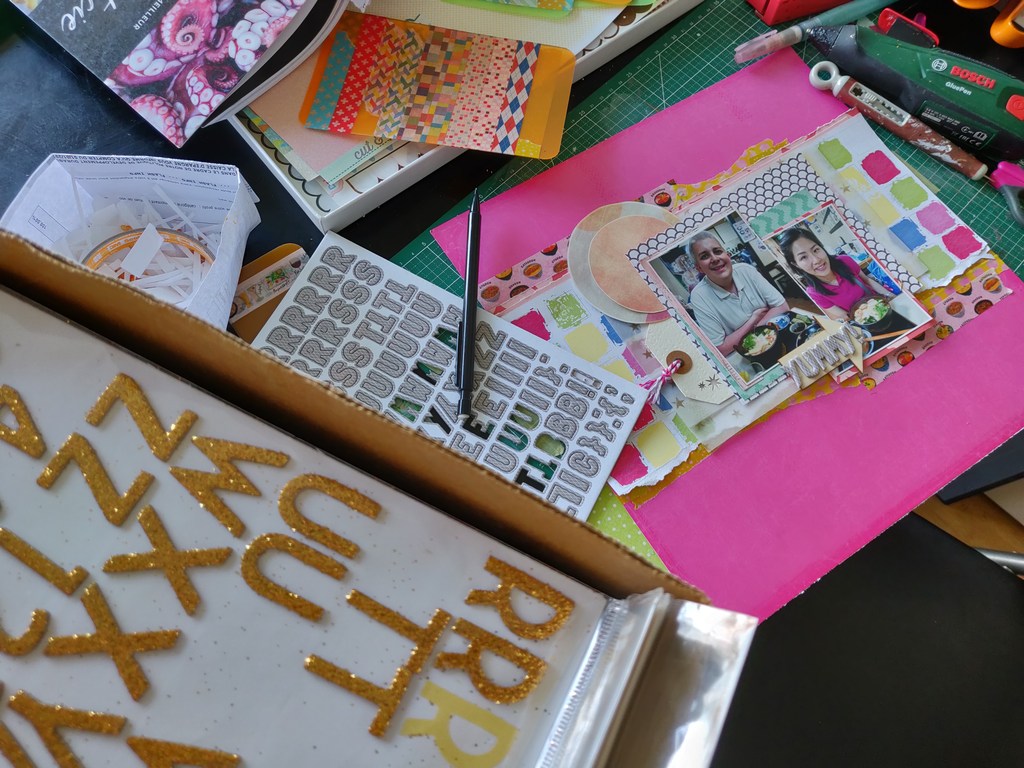
As I like the design of alphabets, I just simply glued the word UDON down on the page without decorating anything around the title.
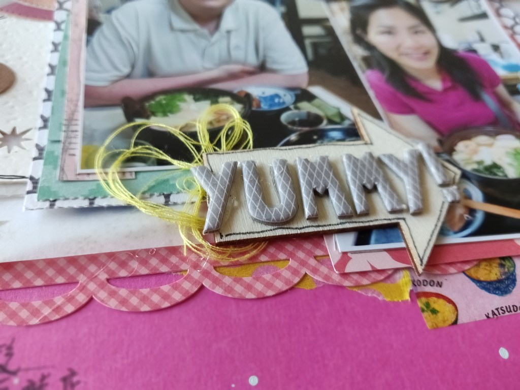
I used a piece of arrow wood veneer on which I adhered the subtitle Yummy!. I also drew a black outline around the arrow so that it won’t get lost among many colors.
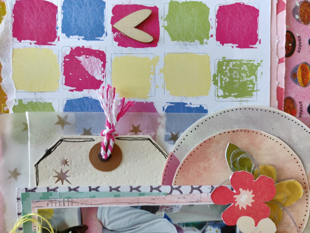
In addition to the arrow, I added three hearts from Roise’s studio inside the colorful squares of the background patterned paper.
On the top left side of the photo, I added two circles and some flowers that I fussy cut from a piece of patterned paper I found in my stash. Don’t forget to add some threads behind the flowers to add some textures.
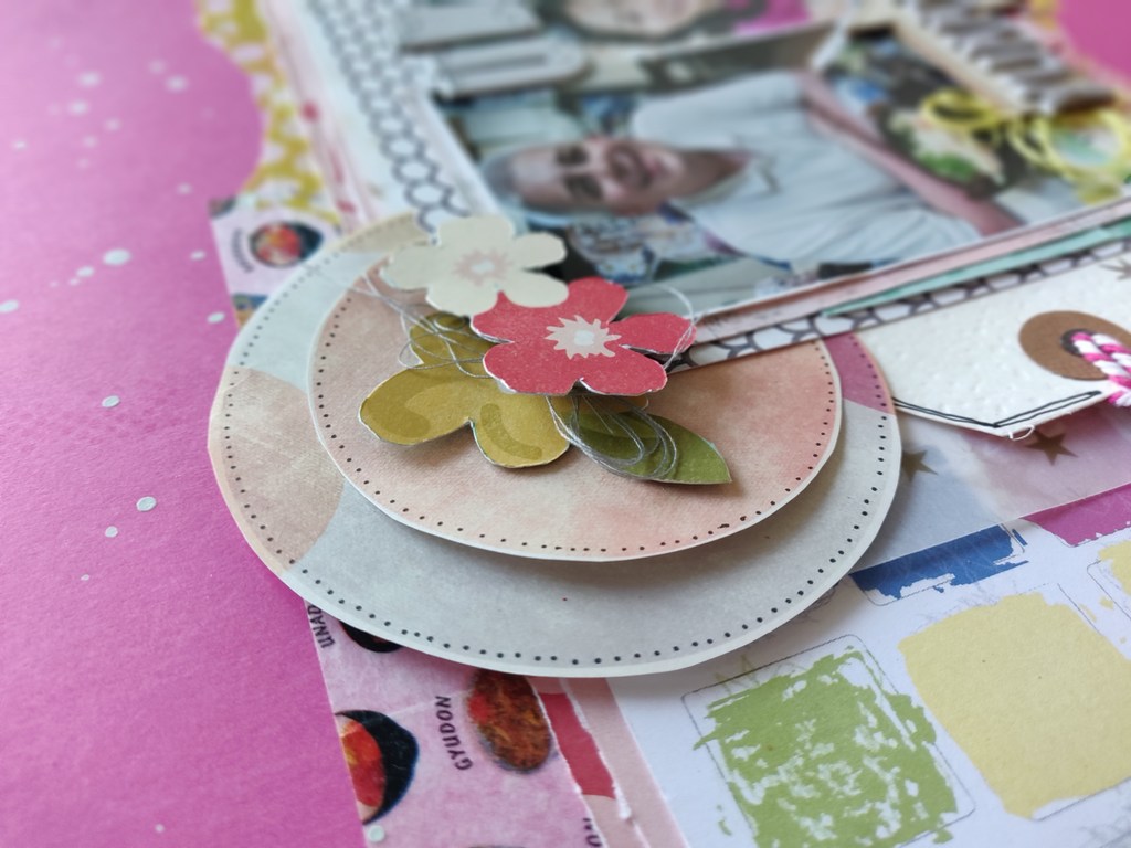
I did the same decoration on the right side of the photo. I added two strips of Japanese food washi tapes on both the top and down sides of the photos. To create more dynamism, some drops of white watercolor is an easy solution.
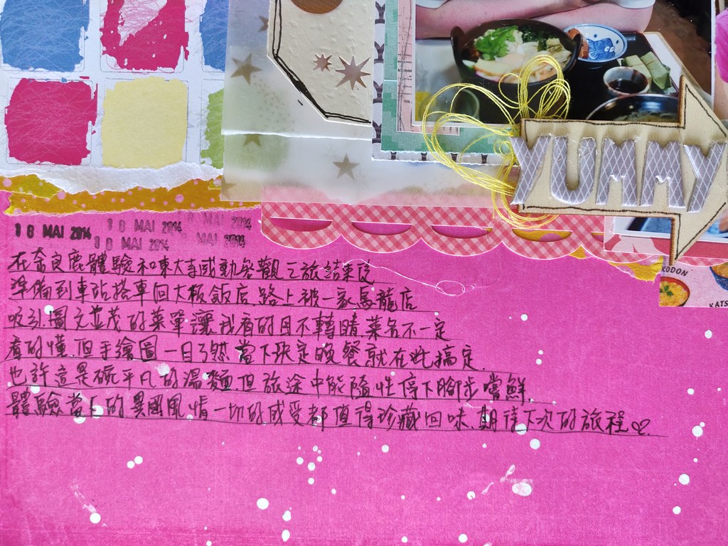
Lastly, I wrote my journaling directly on the vivid violet pink background paper without forgetting stamping the date the photos were taken.
I’m glad that I finished this layout during the weekend. It encouraged me to use some supplies that I treasured a lot and haven’t used much on my previous layouts. I hope that I can keep doing at least one layout per week. Scrapbooking is so much fun.
Fantastic layout. Love the details and stash use. Thanks for your entry in our challenge at Scrap Our Stash. Happy Scrapping!
Hi, yes. It is great to use our STASH. Love it. 😀
Your layout is really beautiful. I love the bright colors and the design. Thanks so much for joining us at Scrap Our Stash – Karen
Hi Karen, thank you for your comment. I don’t often have bright color pages but this challenge enabled me to do something differently.
What a great tutorial – LOVE your layout and I have WASHI envy!! Noodle Bowl Washi!! who knew! <3 -Thanks for playing along with us at the Scrap Our Stash Blog!
Thank you for your comment. It is interesting to be able to find those original washi tapes. 😀